Overview
 GLG's extensive library of
dials and meters,
charts,
process control widgets,
gauges
and other graphical components is built on top of the Toolkit's object
engine - an approach radically different from the
traditional methods of creating programming components.
GLG's extensive library of
dials and meters,
charts,
process control widgets,
gauges
and other graphical components is built on top of the Toolkit's object
engine - an approach radically different from the
traditional methods of creating programming components.
Instead of writing a custom class or code for
each component, a component is just a drawing created using the
Graphics Builder and
comprised of a collection of graphical objects which define the
graphical appearance of each widget. The connections between
objects in the drawing are also wired within the Builder to
define the component's logical behavior.
At run time, the component's drawing is loaded
into the GLG object engine, which renders the component on the
screen and handles user interaction according to the component
description defined in the drawing file. The GLG object engine is
encapsulated in a GLG Widget, which presents the user with a
simple resource-based
Programming API for loading the component and updating it
with real-time data.
The obvious benefit of the GLG component design
approach is component's portability: as soon as the GLG object
engine is ported to a new platform or programming environment, all
GLG widgets are immediately available. For example, all GLG
widgets are available on a variety of hardware and software
platforms, as well as in C/C++/C#/.NET, Java and
JavaScript / React / Angular / Next.js.
Since the components are built on top of the
Toolkit's vector graphics engine, they are
screen-resolution
independent. When the control is resized, the graphics
inside it are resized as well to fit its new extent. The Toolkit
also handles flicker-free updates and all
platform-dependent details of the low-level graphics, so the
developer does not need to. A run-time choice of an
OpenGL or a native GDI
renderer is also available, with no additional programming
required.
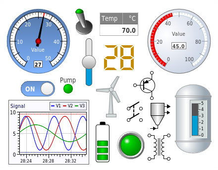 The Graphics Builder may be
used to customize each component interactively. In addition to
changing the component's resources, it also allows the user to
edit the component's graphics directly, changing its shape or
adding/deleting new graphical objects to the component's drawing.
For example, it is possible to change the shape of a dial's needle
or to copy and paste it to add a second needle. Another example is
adding custom annotation labels to a graph, or adjusting the size
of its plotting area to leave more space for custom labels. The
Graphics Builder may also be used to create
custom
dashboards and
simulation
control panels that contain multiple widgets to be deployed
as one component, while each individual widget on the page can be
still be updated independently.
The Graphics Builder may be
used to customize each component interactively. In addition to
changing the component's resources, it also allows the user to
edit the component's graphics directly, changing its shape or
adding/deleting new graphical objects to the component's drawing.
For example, it is possible to change the shape of a dial's needle
or to copy and paste it to add a second needle. Another example is
adding custom annotation labels to a graph, or adjusting the size
of its plotting area to leave more space for custom labels. The
Graphics Builder may also be used to create
custom
dashboards and
simulation
control panels that contain multiple widgets to be deployed
as one component, while each individual widget on the page can be
still be updated independently.
All components may be reused in different programming environments
using a choice of C/C++, Java, C# .NET, ActiveX or JavaScript
programming containers
provided by the Toolkit for a
variety of Unix/Linux,
Windows and Web/Mobile platforms. Since each component is
completely defined by its GLG drawing and has no
source code, no porting is required.
The Toolkit provides a variety of native
programming containers for integrating GLG components into users'
applications: a Motif, Gtk or
Qt widget for X/Unix/Linux environment, a custom control, an
MFC class, a C# User Control or
an ActiveX Control for
Windows, and a Java bean
for Java applications. The Java version of the Toolkit uses its
own, 100% pure Java object engine, while the C# version implements
the GLG object engine in C#. The Web edition of the Toolkit uses
HTML5 and JavaScript rendering engine. GLG's easy-to-use
Programming API is provided for
altering the appearance of components at run-time.
In addition to the widget containers for
integration with the platform's native programming environment, a
generic cross-platform API
is also provided. If the generic
API is used, the same source code may be compiled and run on
any supported C/C++ platform without any changes.
›
GLG Widgets FAQs
Customizing Look and Feel
 The toolkit provides several pre-built widget sets:
Each widget set contains from ten to a hundred
widgets. Each widget is simply a drawing created with the
Graphics Builder.
The component's drawing can be loaded into the
Graphics Builder for
browsing its resources or interactive editing. Since the component is a
collection of graphical objects, it is extremely flexible. The control's
appearance (colors, shapes and position of objects, etc.) can be changed
interactively using the Builder's point and click interface, and a
modified component can be saved for later use. More extensive
customization, such as adding new labels, legends, and axes can also be
performed.
 Since the visual appearance is encapsulated in the drawing, the
application does not have to be recompiled every time the drawing
changes. This enables fast prototyping by eliminating
time-consuming compile-link cycles.
Since the visual appearance is encapsulated in the drawing, the
application does not have to be recompiled every time the drawing
changes. This enables fast prototyping by eliminating
time-consuming compile-link cycles.
All aspects of the component may be
completely customized with the Builder, which eliminates the notion of a
component's source code, since the drawing serves as a complete
description of the object's appearance and behavior.
The Graphics Builder allows the developer to give
custom names to a component's attributes. This provides an easy
access to any component's attribute, which is not possible for
code-based components, whereas only attributes that were handled
in the code are accessible. Such named attributes become resources
and can be accessed from the program at run-time to alter a
component's appearance or to supply dynamic real-time data.
The Graphics Builder can also be used to create
panels or dashboards containing multiple controls. Simply create a
new canvas, drag-and-drop, position and resize controls using the
mouse, name each control to access its resources and save the
drawing. The control panel is now ready to be used in an
application. It can also be prototyped with simulated data in the
Builder.
›
More information on the Graphics Builder
Creating New Custom Components
 New custom components can be created from scratch using the
Professional or
Enterprise Editions of
the Graphics Builder. It is also possible to use an existing
component as a template and modify it. For example, a second
needle may be added to a dial by copying the dial's needle and
pasting the copy into the dial. After the second instance of the
needle is renamed, it is ready to be driven by program's data.
Since the needle object encapsulates all its controlling
parameters, no extra work is necessary. The needle's dynamics
parameters will have been copied. The simulation panel shown on
the right uses avionics gauges
widget set and is a good example of a custom component.
New custom components can be created from scratch using the
Professional or
Enterprise Editions of
the Graphics Builder. It is also possible to use an existing
component as a template and modify it. For example, a second
needle may be added to a dial by copying the dial's needle and
pasting the copy into the dial. After the second instance of the
needle is renamed, it is ready to be driven by program's data.
Since the needle object encapsulates all its controlling
parameters, no extra work is necessary. The needle's dynamics
parameters will have been copied. The simulation panel shown on
the right uses avionics gauges
widget set and is a good example of a custom component.
Newly created custom components can be integrated
into the Graphics Builder, in which case they will appear in the
Builder's component palette.
Custom components are not limited to graphs,
meters or dials. A custom component may be as complex as a dynamic
process control drawing used to
visualize the state of a chemical process. The parameters
controlling a drawing's dynamics are exported as resources and may
be used by the program to update the drawing with real-time data.
The Professional Edition of the Graphics Builder provides the
functionality required to build such custom drawings from scratch. The
Enterprise Edition includes support for handling complex user
interactions through custom events and simplified widget editing via
public properties.
›
More information on Builder Editions
Programming API
GLG's easy-to-use Programming API is resource based. Instead of
learning a separate method for each of the component's resources, a
single SetResource method is used to set any of its resources,
even custom attributes created by the user. All a programmer needs to
know is the name of a given resource, either an intuitive default such
as FillColor, or a custom name given to the resource by the
developer.
The Toolkit can be deployed using a variety of programming
environments, as well as the
hardware and software
platforms. GLG components may be deployed using either a
cross-platform or a native platform-specific programming
container. A cross-platform
C/C++ API may be used in a platform-independent way on both
Unix/Linux and Windows, enabling an application to be compiled and
run on any platform without any changes to its source code.
An MFC class
for Windows and a Motif, Gtk or
Qt widget for Unix/Linux provide native deployment
containers for the respective programming environments. A
Java bean and Java class
library for the Java development, as well a choice of a
C# User Control or an
ActiveX Control for the C#
and VB.NET deployment are also provided. The HTML5 JavaScript
library provides a Web deployment option, with React,
Angular and Next.js components for integration in the
React,
Angular and
Next.js frameworks.
›
More information on programming containers and deployment options
The Programming API may be used to modify
resources of components at run-time and animate the component with
real-time data. It may also be used to handle user interaction.
›
Using the API to supply data
Use the following links for more information on specific GLG
Programming API topics:
›
Cross-Platform Use
›
Integration with Application Environment
›
Data Integration and Supply
›
Object Selection
›
User Interaction
The Extended API allows the
application to create and add objects to the drawing
programmatically. This is convenient if the nature of the graphics or
the number of objects is not known until run-time. The Extended API may
also be used to implement
drawing editor functionality
(such as dragging objects with the mouse).
›
GLG Extended API Details
Royalty-Free Deployment
GLG widget components and the GLG Standard API are royalty-free
and can be distributed with your application with no run-time
fees.
› Widget Gallery
› GLG Widgets FAQ
Pricing Information
The GLG Widget Starter Package includes the Widget Editor
(available in either the Limited or Basic Edition of the Graphics
Builder), one Widget Set, and your choice of a Deployment
Library—such as C/C++, Java, C#, JavaScript, or an ActiveX
Control. You may further customize your package by adding additional
widget sets as needed.
›
Detailed pricing information
While the Professional Edition allows you to build
custom components and drawings from scratch, the Enterprise
Edition extends these capabilities by allowing you to add custom
events to objects for implementing sophisticated user interaction logic
and public properties for simplified widget editing.
›
More information on Builder Editions


